%20(1).png?width=2500&height=1667&name=Portal%20Drop%20Down%20(1)%20(1).png "Take a Tour of Adswerve Connect")
Share


When I first got started in digital marketing circa 2007, Hibox was still one of the many Web Analytics tools popular on the market and Excel was THE dominant analytic/reporting tool of the day. Fast forward nearly 15 years and my how things have changed! Google & Adobe now dominate the web analytics market while several new analytic reporting tools, including Tableau, have come onto the scene giving Excel a run for its money. As someone that cut my analytics teeth (and spent countless hours building reports) in Excel, these new reporting tools have come as nothing short of a blessing. As is the case with most change, making the transition to a new tool can also come with some challenges. For me, one of the biggest pain-points, when first getting started in Tableau, was trying to independently apply conditional formatting to my different metric columns in a summary table like this:
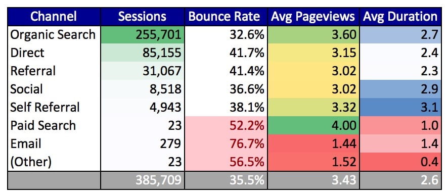 I personally use Summary tables in reporting quite often. I find it is a good way to visualize and compare relevant performance metrics across various segments of data (i.e. marketing channel, landing page, etc) all in one single chart. However, for Summary tables to be truly impactful in reporting, it is often necessary to make certain data points “pop-out” using conditional formatting to highlight particularly meaningful values. That is relatively easy and intuitive to accomplish in Excel but is actually quite difficult for the new user to figure out in Tableau. That is because conditionally formatting table views in Excel and Tableau are two very different processes. In Excel, you have the ability to independently format each and every cell within the spreadsheet view, while in Tableau the formatting functionality was built with a more “all or nothing” orientation. Nevertheless, there is a workaround in Tableau using a dummy calculated metric and the Marks Card that will allow you to achieve similar conditional formatting capabilities to what is available in Excel.
So if you want to create a Summary table in Tableau that uses independent conditional formatting in each column, then today is your lucky day! Just follow these steps (and accompanying screenshots to help visually guide you through the process), and you’ll be well on your way to creating customized Summary tables that will wow your reporting stakeholders.
I personally use Summary tables in reporting quite often. I find it is a good way to visualize and compare relevant performance metrics across various segments of data (i.e. marketing channel, landing page, etc) all in one single chart. However, for Summary tables to be truly impactful in reporting, it is often necessary to make certain data points “pop-out” using conditional formatting to highlight particularly meaningful values. That is relatively easy and intuitive to accomplish in Excel but is actually quite difficult for the new user to figure out in Tableau. That is because conditionally formatting table views in Excel and Tableau are two very different processes. In Excel, you have the ability to independently format each and every cell within the spreadsheet view, while in Tableau the formatting functionality was built with a more “all or nothing” orientation. Nevertheless, there is a workaround in Tableau using a dummy calculated metric and the Marks Card that will allow you to achieve similar conditional formatting capabilities to what is available in Excel.
So if you want to create a Summary table in Tableau that uses independent conditional formatting in each column, then today is your lucky day! Just follow these steps (and accompanying screenshots to help visually guide you through the process), and you’ll be well on your way to creating customized Summary tables that will wow your reporting stakeholders.
 This is what the Tableau worksheet should look like after you’ve added all the appropriate pills to the Columns & Rows shelves.
 After updating the Axis settings for every column, your Tableau worksheet should now look something like this:
 Your Worksheet should now look something like this with the only single column displaying the metric and color pills you added to the specific Marks Card.
 At this point, you’ve essentially recreated the above Excel summary table in Tableau. Great job!
However, if you are a stickler for formatting like I am, you too might be (excessively?) bothered by the positioning of the column labels at the bottom of the table rather than at the top, as is typically the standard. Tableau’s default positioning here would be great if we were displaying bar charts, but it is not so wonderful for displaying column labels for a table! So if you are similarly annoyed by this tool quirk, you can simply uncheck the “Show Header” setting by right-clicking in the header and then manually adding the column labels in your Dashboard view, which will give you far more control over formatting those particular visual elements.
At this point, you’ve essentially recreated the above Excel summary table in Tableau. Great job!
However, if you are a stickler for formatting like I am, you too might be (excessively?) bothered by the positioning of the column labels at the bottom of the table rather than at the top, as is typically the standard. Tableau’s default positioning here would be great if we were displaying bar charts, but it is not so wonderful for displaying column labels for a table! So if you are similarly annoyed by this tool quirk, you can simply uncheck the “Show Header” setting by right-clicking in the header and then manually adding the column labels in your Dashboard view, which will give you far more control over formatting those particular visual elements.
 And if you made it this far, I hope you found this tutorial helpful. I've created a sample dashboard file for you to download and interact with! Happy reporting! :-)
 Update: If you want to change the position of the axes label from bottom to top within the sheet, it's possible! Stay tuned, we have another blog post (coming soon) to show you how.
I personally use Summary tables in reporting quite often. I find it is a good way to visualize and compare relevant performance metrics across various segments of data (i.e. marketing channel, landing page, etc) all in one single chart. However, for Summary tables to be truly impactful in reporting, it is often necessary to make certain data points “pop-out” using conditional formatting to highlight particularly meaningful values. That is relatively easy and intuitive to accomplish in Excel but is actually quite difficult for the new user to figure out in Tableau. That is because conditionally formatting table views in Excel and Tableau are two very different processes. In Excel, you have the ability to independently format each and every cell within the spreadsheet view, while in Tableau the formatting functionality was built with a more “all or nothing” orientation. Nevertheless, there is a workaround in Tableau using a dummy calculated metric and the Marks Card that will allow you to achieve similar conditional formatting capabilities to what is available in Excel.
So if you want to create a Summary table in Tableau that uses independent conditional formatting in each column, then today is your lucky day! Just follow these steps (and accompanying screenshots to help visually guide you through the process), and you’ll be well on your way to creating customized Summary tables that will wow your reporting stakeholders.
Steps to creating Conditional Formatting in a Summary Table
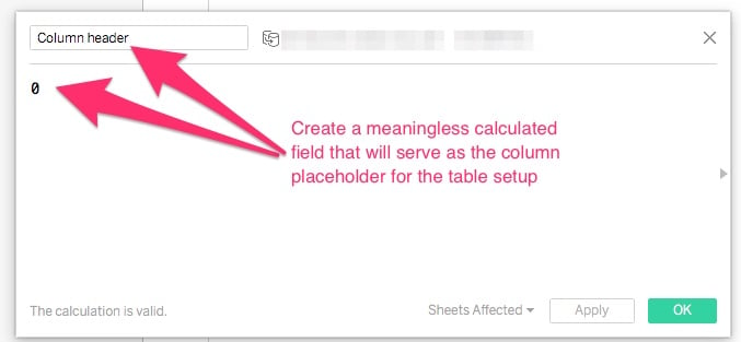
- In your Tableau worksheet, first create a dummy calculated field that will be used as the base for each individual column in the table.
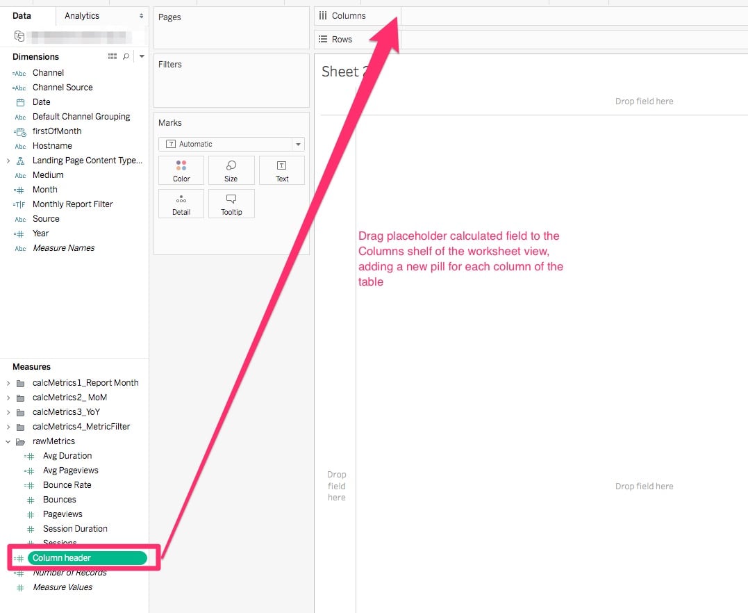
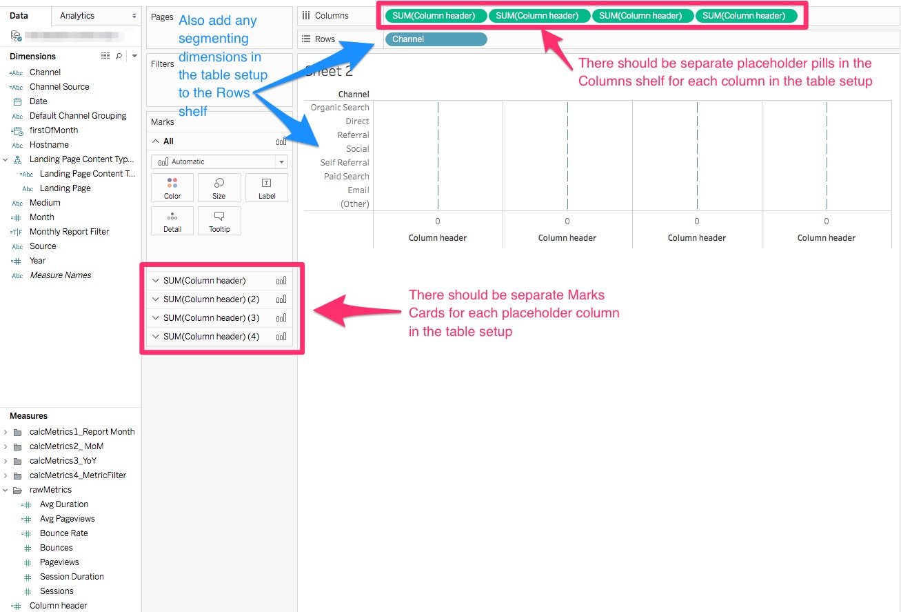
- Start dragging the placeholder dummy calculated field to the Column shelf, adding a new pill for each column to be included in the table setup. Also, add any of the applicable segmenting dimensions in the table setup to the Row shelf, as well.
This is what the Tableau worksheet should look like after you’ve added all the appropriate pills to the Columns & Rows shelves.
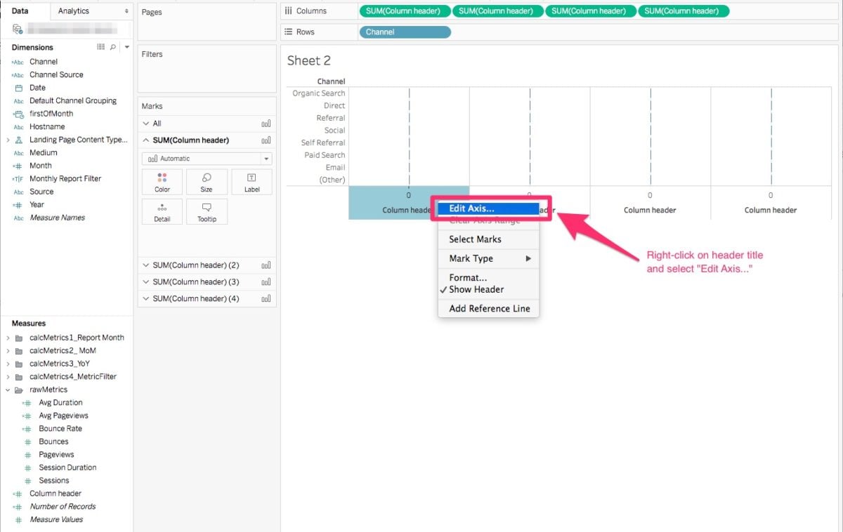
- Right-click on a column header title and select “Edit Axis…”
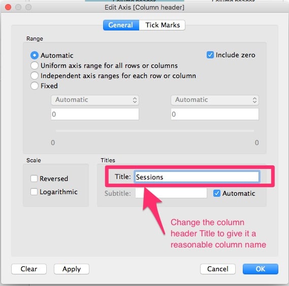
- Once the Edit Axis pop-up screen appears, change the ‘Title’ field entry to give the column a reasonable label name.
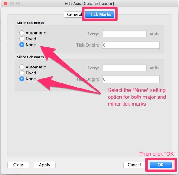
- Then click over to the “Tick Marks” menu at the top of the pop-up screen, update tick mark settings to “None”, and click “OK”.
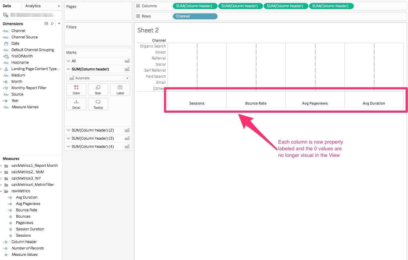
After updating the Axis settings for every column, your Tableau worksheet should now look something like this:
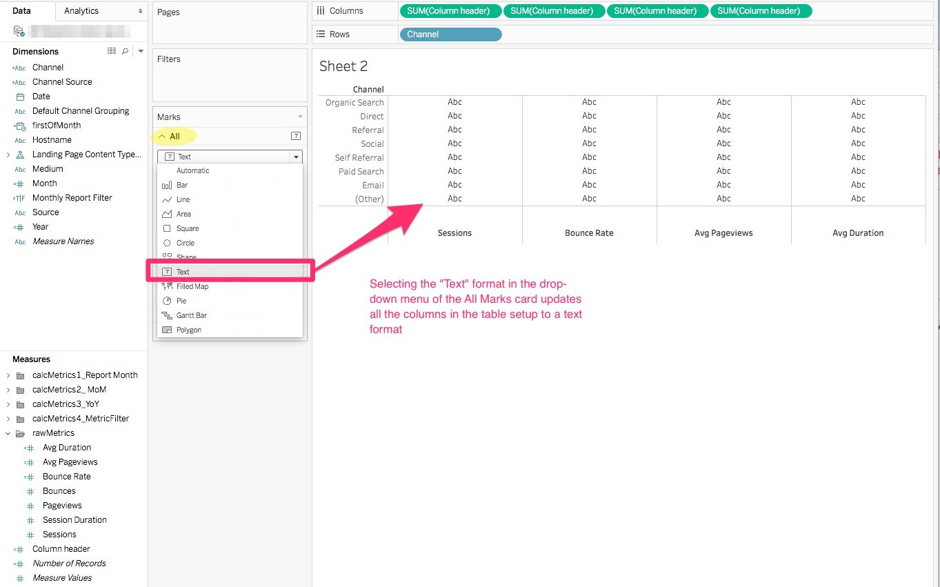
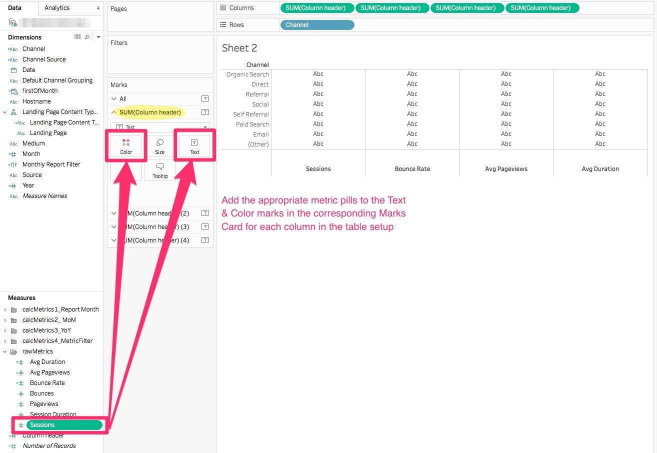
- Update the “All” Marks Card to text format.
- Add the appropriate metric to the corresponding Text & Color marks in the Marks Card for each column in the table setup. Note: in this example, I’m using the same metric for the Text & Color marks for the sake of simplicity. However, you can also choose to create and use a separate calculated field(s) to control the Color formatting for each column.
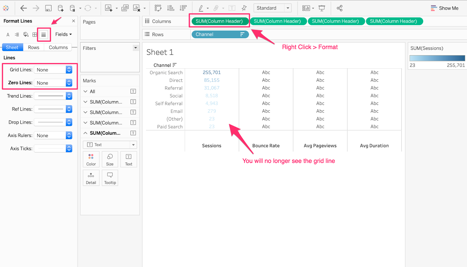
- In order to remove the gridlines in the columns, right-click on the Column and click “Format”. On the Format Lines Navigation Pane, click on the “Line” icon. Change the Grid Line and Zero Line to “None”.
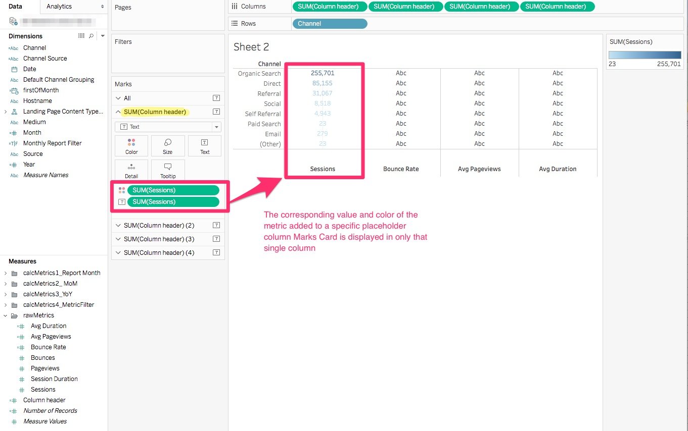
Your Worksheet should now look something like this with the only single column displaying the metric and color pills you added to the specific Marks Card.
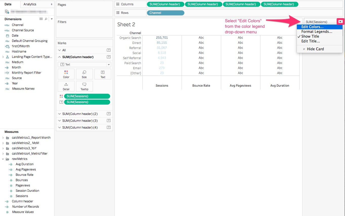
- (Optional) Edit the conditional formatting in the column to suit your needs.
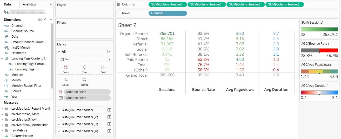
- Repeat the previous two steps for all columns in the table set up in which you desire to apply conditional formatting, and your table should now look something like this:
At this point, you’ve essentially recreated the above Excel summary table in Tableau. Great job!
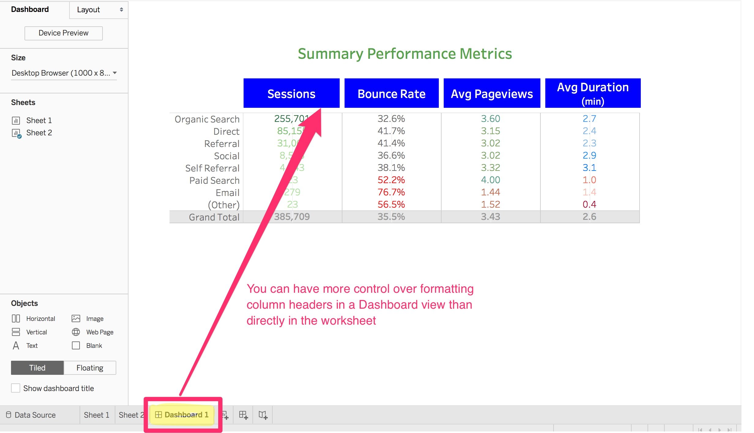
However, if you are a stickler for formatting like I am, you too might be (excessively?) bothered by the positioning of the column labels at the bottom of the table rather than at the top, as is typically the standard. Tableau’s default positioning here would be great if we were displaying bar charts, but it is not so wonderful for displaying column labels for a table! So if you are similarly annoyed by this tool quirk, you can simply uncheck the “Show Header” setting by right-clicking in the header and then manually adding the column labels in your Dashboard view, which will give you far more control over formatting those particular visual elements.
And if you made it this far, I hope you found this tutorial helpful. I've created a sample dashboard file for you to download and interact with! Happy reporting! :-)
Update: If you want to change the position of the axes label from bottom to top within the sheet, it's possible! Stay tuned, we have another blog post (coming soon) to show you how.