%20(1).png?width=2500&height=1667&name=Portal%20Drop%20Down%20(1)%20(1).png "Take a Tour of Adswerve Connect")
Share


Google Analytics' web interface offers a great way to manipulate our data. But if we want to take it a step further and deeper we need to look at tools like the Google Analytics Reporting API and R. In this article I will introduce the minute (time) dimension and its usability. There are many uses for it and it is important that we understand how it works and how to acquire the right data to build our analysis on.
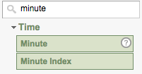
 Google Analytics By Hour[/caption] However it is possible to dig deeper, using secondary dimensions. You will notice there are actually two dimensions associated with minutes. A minute dimension, which corresponds to a minute inside an hour and can take any value from 0 to 59, and a
minute index dimension which will break down a selected date range to one minute segments indexed from 0 on. If we limit our date range to one day the minute index dimension will take values from 0 to 1439 (1440 minutes in a day).
Google Analytics By Hour[/caption] However it is possible to dig deeper, using secondary dimensions. You will notice there are actually two dimensions associated with minutes. A minute dimension, which corresponds to a minute inside an hour and can take any value from 0 to 59, and a
minute index dimension which will break down a selected date range to one minute segments indexed from 0 on. If we limit our date range to one day the minute index dimension will take values from 0 to 1439 (1440 minutes in a day).
 Very likely you will find minute index much more useful. If we look at sessions and limit our date range to one day, a minute index will make more sense - showing number of sessions for every minute of the day whereas minute dimension will sum up all the sessions for a certain minute value across 24h. For example a minute dimension value 5 would sum up sessions from 00:05, 01:05, 02:05 ... 23:05 which may not be of much value. You could make more sense out of data if you limit your data to 1 hour using segments, but using minute index will save you a lot of query complexity. There is certainly a lot you can do with different set ups inside the Google Analytics web interface using minute dimension, but lets take it a step further and see what we can do with it using the Google Analytics API.
 Sessions minute by minute[/caption] There is one thing that is very noticeable in the chart, that spike of sessions in the first couple of minutes after midnight. All Google Analytics sessions
expire at midnight therefore all the users that were browsing your website from before midnight till after midnight will count independent sessions.The sessions metric shows us how many sessions started in a certain minute. It should not be confused with an
active visitors metric from the real time analytics which tells us how many visitors are on the website in that moment. Now lets construct another query to see what was the minute by minute distribution of visitors from Google the morning (9-10AM) of the new year day. Just to display how easy it is to do some analysis with R I will put a red linear regression line on the same plot. The parameters we will use are
"2014-01-01" for start and end date,
ga:minute dimension, a
ga:sessions metric and filter by
ga:hour==09 and
ga:source==google. Semicolon acts as an
and operator in filters.
Sessions minute by minute[/caption] There is one thing that is very noticeable in the chart, that spike of sessions in the first couple of minutes after midnight. All Google Analytics sessions
expire at midnight therefore all the users that were browsing your website from before midnight till after midnight will count independent sessions.The sessions metric shows us how many sessions started in a certain minute. It should not be confused with an
active visitors metric from the real time analytics which tells us how many visitors are on the website in that moment. Now lets construct another query to see what was the minute by minute distribution of visitors from Google the morning (9-10AM) of the new year day. Just to display how easy it is to do some analysis with R I will put a red linear regression line on the same plot. The parameters we will use are
"2014-01-01" for start and end date,
ga:minute dimension, a
ga:sessions metric and filter by
ga:hour==09 and
ga:source==google. Semicolon acts as an
and operator in filters.
 Linear regression line shows growing sessions originating from Google[/caption] With your data in R your analysis options are limitless, I hope you enjoyed these examples, please comment with your thoughts and discoveries using the minute dimension.
*While Google Analytics API lets you fragment your data down to a minute, you can always take it a few steps further. Look at our Big Query for Google Analytics article.
Linear regression line shows growing sessions originating from Google[/caption] With your data in R your analysis options are limitless, I hope you enjoyed these examples, please comment with your thoughts and discoveries using the minute dimension.
*While Google Analytics API lets you fragment your data down to a minute, you can always take it a few steps further. Look at our Big Query for Google Analytics article.
What Is a Dimension?
Dimensions in Google Analytics are used to break down metrics by a certain set of parameters. For example we can break down number of sessions by day, browser, country, source, medium or any other of over 100 dimensions that are available in Google Analytics.The Minute Dimension
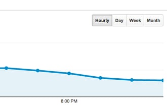
The minute dimension was introduced to Google Analytics about a year ago and it offers a minute by minute look into your analytics. Currently, Google Analytics web interface only offer viewing your data by bigger chunks of time (month, week, day and hour). [caption id="attachment_9323" align="alignnone" width="330"] Google Analytics By Hour[/caption] However it is possible to dig deeper, using secondary dimensions. You will notice there are actually two dimensions associated with minutes. A minute dimension, which corresponds to a minute inside an hour and can take any value from 0 to 59, and a
minute index dimension which will break down a selected date range to one minute segments indexed from 0 on. If we limit our date range to one day the minute index dimension will take values from 0 to 1439 (1440 minutes in a day).
Google Analytics By Hour[/caption] However it is possible to dig deeper, using secondary dimensions. You will notice there are actually two dimensions associated with minutes. A minute dimension, which corresponds to a minute inside an hour and can take any value from 0 to 59, and a
minute index dimension which will break down a selected date range to one minute segments indexed from 0 on. If we limit our date range to one day the minute index dimension will take values from 0 to 1439 (1440 minutes in a day).
 Very likely you will find minute index much more useful. If we look at sessions and limit our date range to one day, a minute index will make more sense - showing number of sessions for every minute of the day whereas minute dimension will sum up all the sessions for a certain minute value across 24h. For example a minute dimension value 5 would sum up sessions from 00:05, 01:05, 02:05 ... 23:05 which may not be of much value. You could make more sense out of data if you limit your data to 1 hour using segments, but using minute index will save you a lot of query complexity. There is certainly a lot you can do with different set ups inside the Google Analytics web interface using minute dimension, but lets take it a step further and see what we can do with it using the Google Analytics API.
Why Use Minute Dimension?
Fragmenting your data by minute allows you to see great insights in user responses to different events that take place inside or outside your website. Some of the possibilities of use are:- Tracking TV ads - lets say we're interested in tracking how our "new product" commercial performed on the TV yesterday. We advertised the product on January 5th 2015, at 2:15PM (14:15) displaying a URL pointing to ourwebsite.com/new-product. To get minute by minute data of the user response, we're going to query for start date and end date "2015-01-05", dimension ga:minute, metric ga:sessions and filter by ga:hour==14 and ga:medium==direct.
- Introducing our product at a conference in Asia - this one is a little tricky because you need to be careful what day and hour you select. Every view in your Google Analytics account has a set Time zone. So if we introduced our product at 10AM on Friday in Tokyo, that would mean that in our GA we should query for Thursday at 5pm if our timezone is set to United States Pacific Time. [caption id="attachment_9337" align="alignnone" width="386"]
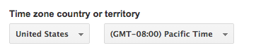 Make sure to convert local times to your timezone.[/caption]
 - Tracking Tweet impact - To see minute by minute how our tweet performed we need to filter by source Twitter and medium social, for the time we're interested in our tweet performance. In this example lets also mention that Twitter offers a pretty good analytics platform for doing that. Combining the two could get you some awesome insights on when to tweet and what to write...
- Radio ad in NY - This one is interesting because of a city specific ad. To track this ad minute by minute after it was played on the radio we should use a geographical filter ga:city == New York.
- Server down damage - Our server went down at a certain time, see exactly how many minutes no pages were loaded.
- Slow website load time - Your website was loading slow this last Wednesday. Compare your data to the same time of day from last Wednesday, compare the numbers, find out if there were less pageviews per session because of it using ga:pageviewsPerSession metric and see if your earnings suffered using ga:transactionValue.

How to Get Minute Dimensions in R?
R offers us a fast way to get, clean, work on and visualize the data from the examples described above. To learn how to get Google Analytics data to R check out our How to Connect Google Analytics with R tutorial. In the following cases I will be assuming we have already done the first 4 steps from the tutorial and are ready for querying. First lets display a minute by minute bar chart of all sessions on our website on January 20th, 2014. First we'll construct a list of parameters for the query. Start date and end date should be the same to limit our query on the January 20th, we will use minute dimension to fragment our data by minute and use sessions metric to see how many sessions we had. Make sure to replace table.id value with your view id value. We will also need to use max.results parameter to tell Google Analytics API that we're expecting more than 1000 results (which is the default limit for the number of rows). We are expecting 1440 rows (minutes in the day). query.list <- Init(start.date = "2014-01-20",
end.date = "2014-01-20",
dimensions = "ga:minute",
metrics = "ga:sessions",
max.results = 10000,
table.id = "ga:12345678")
Now lets construct the query object from the query parameters.
ga.query <- QueryBuilder(query.list)
ga.data <- GetReportData(ga.query, token)
Now that we have the data we should clean it. The x and y for our plot will be hours and sessions from the query response.
x <- as.numeric(ga.data$hour) + as.numeric(ga.data$minute)/60
y <- as.numeric(ga.data$sessions)

plot(x, y, type="h", xlab="Time of day", ylab="Sessions")
The result of the code is: [caption id="attachment_9343" align="alignnone" width="586"]
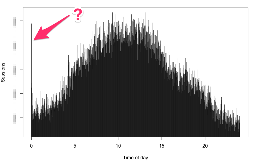 Sessions minute by minute[/caption] There is one thing that is very noticeable in the chart, that spike of sessions in the first couple of minutes after midnight. All Google Analytics sessions
expire at midnight therefore all the users that were browsing your website from before midnight till after midnight will count independent sessions.The sessions metric shows us how many sessions started in a certain minute. It should not be confused with an
active visitors metric from the real time analytics which tells us how many visitors are on the website in that moment. Now lets construct another query to see what was the minute by minute distribution of visitors from Google the morning (9-10AM) of the new year day. Just to display how easy it is to do some analysis with R I will put a red linear regression line on the same plot. The parameters we will use are
"2014-01-01" for start and end date,
ga:minute dimension, a
ga:sessions metric and filter by
ga:hour==09 and
ga:source==google. Semicolon acts as an
and operator in filters.
Sessions minute by minute[/caption] There is one thing that is very noticeable in the chart, that spike of sessions in the first couple of minutes after midnight. All Google Analytics sessions
expire at midnight therefore all the users that were browsing your website from before midnight till after midnight will count independent sessions.The sessions metric shows us how many sessions started in a certain minute. It should not be confused with an
active visitors metric from the real time analytics which tells us how many visitors are on the website in that moment. Now lets construct another query to see what was the minute by minute distribution of visitors from Google the morning (9-10AM) of the new year day. Just to display how easy it is to do some analysis with R I will put a red linear regression line on the same plot. The parameters we will use are
"2014-01-01" for start and end date,
ga:minute dimension, a
ga:sessions metric and filter by
ga:hour==09 and
ga:source==google. Semicolon acts as an
and operator in filters.
query.list <- Init(start.date = "2014-01-01",
                   end.date ="2014-01-01",
                   dimensions = "ga:minute",
                   metrics = "ga:sessions",
                   filters = "ga:hour==09;ga:source==google",
                   table.id = view.id)

ga.query <- QueryBuilder(query.list)
ga.data <- GetReportData(ga.query, token)

x <- as.numeric(ga.data$minute)
y <- as.numeric(ga.data$sessions)

plot(x, y, type="h", lwd=10, xlab="Minute of 9:00, January 1st, 2014", ylab="Sessions")
abline(lm(y~x), col="red", lwd=5)
[caption id="attachment_9365" align="alignnone" width="535"]
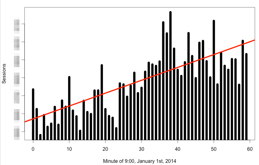 Linear regression line shows growing sessions originating from Google[/caption] With your data in R your analysis options are limitless, I hope you enjoyed these examples, please comment with your thoughts and discoveries using the minute dimension.
*While Google Analytics API lets you fragment your data down to a minute, you can always take it a few steps further. Look at our Big Query for Google Analytics article.
Linear regression line shows growing sessions originating from Google[/caption] With your data in R your analysis options are limitless, I hope you enjoyed these examples, please comment with your thoughts and discoveries using the minute dimension.
*While Google Analytics API lets you fragment your data down to a minute, you can always take it a few steps further. Look at our Big Query for Google Analytics article.