%20(1).png?width=2500&height=1667&name=Portal%20Drop%20Down%20(1)%20(1).png "Take a Tour of Adswerve Connect")
Share


In a recent article on
Mashable it states that 17.4% of all web traffic now comes from mobile phones. Looking through many of our clients data I can anecdotally confirm this. For Web Analysts this metric is very important to keep track of. Many websites today still do not have a mobile optimized experience and many times the data shows that your business suffers as a result. If you do not have a mobile optimized site, I will show you how to uncover evidence of this. On the other hand if you do have a mobile optimized site, I will show you how your analysis is likely flawed or even incorrect.
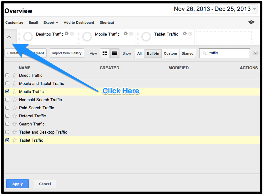
 This report alone should never be the end of your analysis, but the start. Aggregate reports almost never tell the full story correctly. It would be possible for example that the majority of this mobile traffic was hitting my blog in which case these metrics would be normal and likely not change significantly with a mobile optimized site. Your next step will be to use advanced segments to isolate visits where mobile was used. You then need to do your analysis to understand where your mobile traffic is coming from, what they are doing on the site and finally what outcomes or conversions are they completing or dropping from. You can do this Analysis by using these 'Advanced Segments' below:
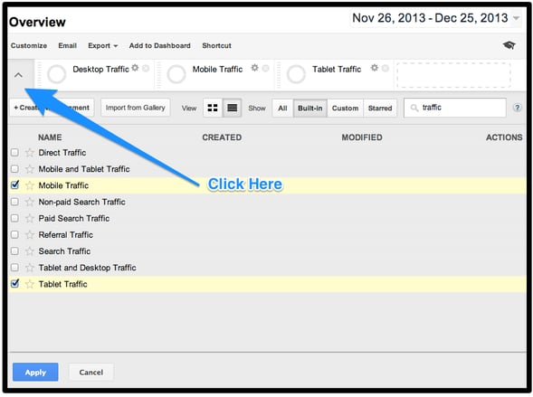 The Mobile and Tablet segments are prebuilt, but Desktop is not provided. You can click
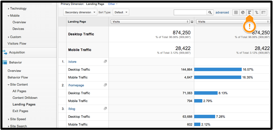
here and save a desktop Advanced Segment I have created for you. Using these you be able to dig up evidence of the effect not having a mobile site is having on your visitors and business. The Landing Pages report would be a great place to start to see if the content being consumed is different. The 'Performance' view highlighted below will show you if theres any percentage differences in the distribution between device categories.
The Mobile and Tablet segments are prebuilt, but Desktop is not provided. You can click
here and save a desktop Advanced Segment I have created for you. Using these you be able to dig up evidence of the effect not having a mobile site is having on your visitors and business. The Landing Pages report would be a great place to start to see if the content being consumed is different. The 'Performance' view highlighted below will show you if theres any percentage differences in the distribution between device categories.


 There is one major flaw in this approach with both the Advanced Segments and the mobile specific view. All mobile specific sites should have the capability where the visitor can click a button or link to view the full site. With this capability it is entirely possible that even though you have a mobile optimized site all of your mobile traffic could be using the desktop experience instead. You should be isolating your segments or views/profiles based on the experience the users is viewing or selected and not solely on the device category. For some websites this is easily determined as each experience resides on a separate hostname. Typically this would be m.espn.go.com for mobile optimized and just espn.go.com if they have opted out. For other websites there is nothing easily distinguishable and you will need to work with your developer to have something usable populated. If you are using Google Tag Manager or another Tag Management System this should exist in your dataLayer.
Another must have implementation piece is to track the number of times, "View Full Site" is clicked on and from which pages. This is a critical metric to have and monitor. If the number of clicks increases significantly in aggregate, on a specific page or for a section of the site it could indicate something is not functioning correctly on the mobile optimized site. Often times when visitors experience problems on mobile sites, they just switch to the full version and/or leave the site, leaving this metric as one of the few ways to catch user experience issues.
There is one major flaw in this approach with both the Advanced Segments and the mobile specific view. All mobile specific sites should have the capability where the visitor can click a button or link to view the full site. With this capability it is entirely possible that even though you have a mobile optimized site all of your mobile traffic could be using the desktop experience instead. You should be isolating your segments or views/profiles based on the experience the users is viewing or selected and not solely on the device category. For some websites this is easily determined as each experience resides on a separate hostname. Typically this would be m.espn.go.com for mobile optimized and just espn.go.com if they have opted out. For other websites there is nothing easily distinguishable and you will need to work with your developer to have something usable populated. If you are using Google Tag Manager or another Tag Management System this should exist in your dataLayer.
Another must have implementation piece is to track the number of times, "View Full Site" is clicked on and from which pages. This is a critical metric to have and monitor. If the number of clicks increases significantly in aggregate, on a specific page or for a section of the site it could indicate something is not functioning correctly on the mobile optimized site. Often times when visitors experience problems on mobile sites, they just switch to the full version and/or leave the site, leaving this metric as one of the few ways to catch user experience issues.
Do You Need a Mobile Site?
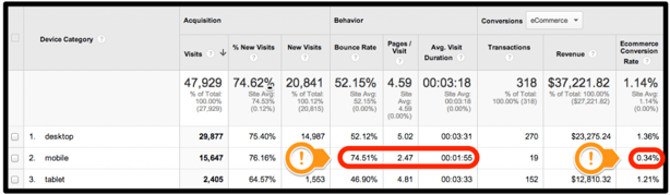
The answer is yes, but unfortunately it is not that simple. Each business has budget and resource constraints, priorities, and potential old infrastructures. You as an Analyst need to be conscious of these and when you push for a mobile optimized site have data to support you. For some of my clients when the analysis was done all of a sudden mobile went from the bottom of the priority list to the top. To start this analysis you should start with the default 'Mobile Overview' report in your 'Audience' section. Below is a screenshot of this report. Right away alarms should be going off if your report looks like this. The three engagement metrics: Bounce Rate, Pages/Visits and Avg. Visit Duration are significantly worse than desktop/tablet devices. Even more important, the E-Commerce conversion rate is way off.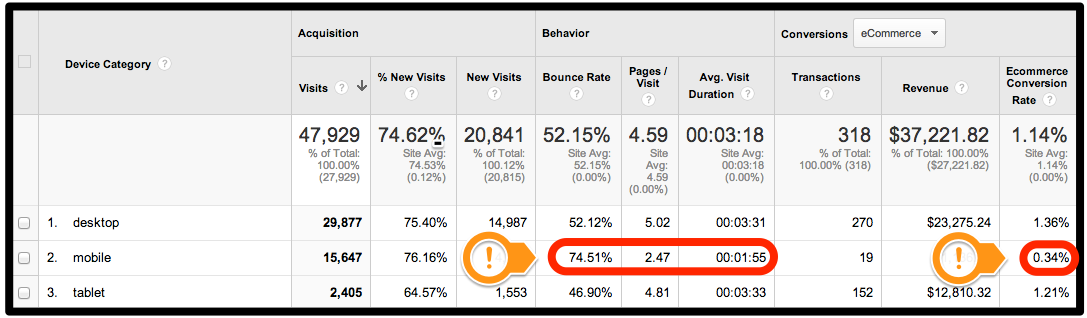 This report alone should never be the end of your analysis, but the start. Aggregate reports almost never tell the full story correctly. It would be possible for example that the majority of this mobile traffic was hitting my blog in which case these metrics would be normal and likely not change significantly with a mobile optimized site. Your next step will be to use advanced segments to isolate visits where mobile was used. You then need to do your analysis to understand where your mobile traffic is coming from, what they are doing on the site and finally what outcomes or conversions are they completing or dropping from. You can do this Analysis by using these 'Advanced Segments' below:
 The Mobile and Tablet segments are prebuilt, but Desktop is not provided. You can click
here and save a desktop Advanced Segment I have created for you. Using these you be able to dig up evidence of the effect not having a mobile site is having on your visitors and business. The Landing Pages report would be a great place to start to see if the content being consumed is different. The 'Performance' view highlighted below will show you if theres any percentage differences in the distribution between device categories.
The Mobile and Tablet segments are prebuilt, but Desktop is not provided. You can click
here and save a desktop Advanced Segment I have created for you. Using these you be able to dig up evidence of the effect not having a mobile site is having on your visitors and business. The Landing Pages report would be a great place to start to see if the content being consumed is different. The 'Performance' view highlighted below will show you if theres any percentage differences in the distribution between device categories.
Already Have a Mobile Site?
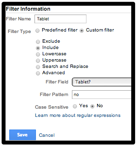
If you already have a mobile optimized site, it is very likely if you are analyzing the effectiveness of it in Google Analytics you are doing in incorrectly. The way most Google Analytics users analyze there mobile site is by either using the prebuilt 'Mobile' Advanced Segment we used above or by setting up a Mobile specific view/profile in Google Analytics. Most mobile specific profiles would have the following two filters to isolate smartphones/small devices.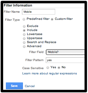
 There is one major flaw in this approach with both the Advanced Segments and the mobile specific view. All mobile specific sites should have the capability where the visitor can click a button or link to view the full site. With this capability it is entirely possible that even though you have a mobile optimized site all of your mobile traffic could be using the desktop experience instead. You should be isolating your segments or views/profiles based on the experience the users is viewing or selected and not solely on the device category. For some websites this is easily determined as each experience resides on a separate hostname. Typically this would be m.espn.go.com for mobile optimized and just espn.go.com if they have opted out. For other websites there is nothing easily distinguishable and you will need to work with your developer to have something usable populated. If you are using Google Tag Manager or another Tag Management System this should exist in your dataLayer.
Another must have implementation piece is to track the number of times, "View Full Site" is clicked on and from which pages. This is a critical metric to have and monitor. If the number of clicks increases significantly in aggregate, on a specific page or for a section of the site it could indicate something is not functioning correctly on the mobile optimized site. Often times when visitors experience problems on mobile sites, they just switch to the full version and/or leave the site, leaving this metric as one of the few ways to catch user experience issues.
There is one major flaw in this approach with both the Advanced Segments and the mobile specific view. All mobile specific sites should have the capability where the visitor can click a button or link to view the full site. With this capability it is entirely possible that even though you have a mobile optimized site all of your mobile traffic could be using the desktop experience instead. You should be isolating your segments or views/profiles based on the experience the users is viewing or selected and not solely on the device category. For some websites this is easily determined as each experience resides on a separate hostname. Typically this would be m.espn.go.com for mobile optimized and just espn.go.com if they have opted out. For other websites there is nothing easily distinguishable and you will need to work with your developer to have something usable populated. If you are using Google Tag Manager or another Tag Management System this should exist in your dataLayer.
Another must have implementation piece is to track the number of times, "View Full Site" is clicked on and from which pages. This is a critical metric to have and monitor. If the number of clicks increases significantly in aggregate, on a specific page or for a section of the site it could indicate something is not functioning correctly on the mobile optimized site. Often times when visitors experience problems on mobile sites, they just switch to the full version and/or leave the site, leaving this metric as one of the few ways to catch user experience issues.
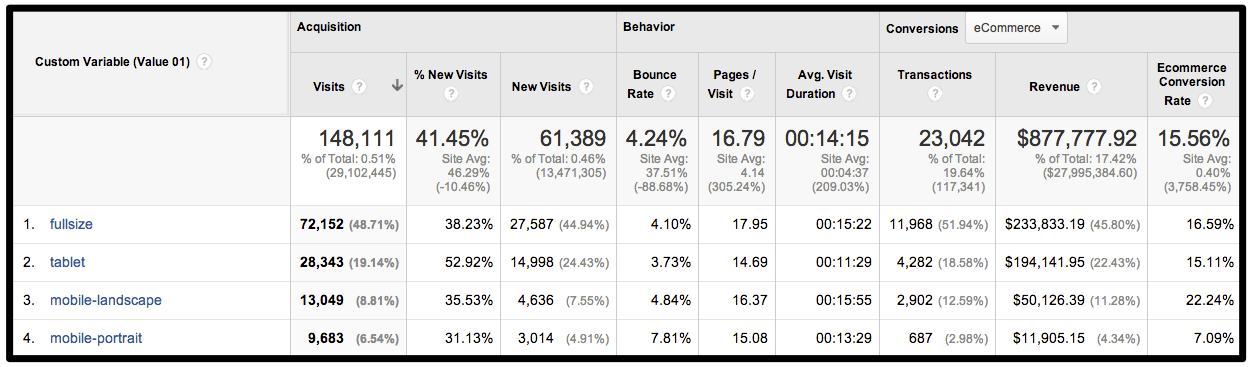
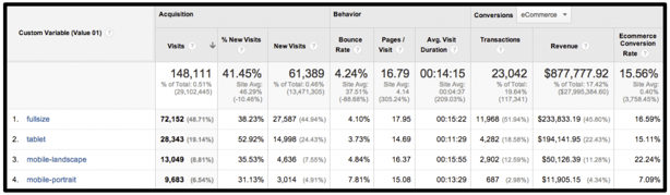
Tracking Responsive Design with Google Analytics
You can take your analysis even further if you are using responsive design. Your web developer should be able to expose, which CSS version of your site is being displayed. Once you have this you can key off of this and pass a custom variable or custom dimension to easily segment and analyze the effectiveness of each version. Heres an example of what the GA code for Classic Analytics would look like: _gaq.push(['_setCustomVar', 1, 'PageVariation', 'fullsize', 3]); _gaq.push(['_setCustomVar', 1, 'PageVariation', 'mobile-landscape', 3]); _gaq.push(['_setCustomVar', 1, 'PageVariation', 'mobile-portrait', 3]); _gaq.push(['_setCustomVar', 1, 'PageVariation', 'tablet', 3]); Once implemented you will have a report like this. Already you can see that that most mobile users prefer to buy on the mobile landscape version.